




















How AI Startups Inflate ARR Metrics to Win Investor Attention
Google’s refreshed app icons feature a glossy, disco-ball-inspired design, drawing mixed reactions from users. The visual overhaul aims to modernise Google’s ecosystem, but many question whether the sparkling new look improves usability or creates unnecessary confusion.
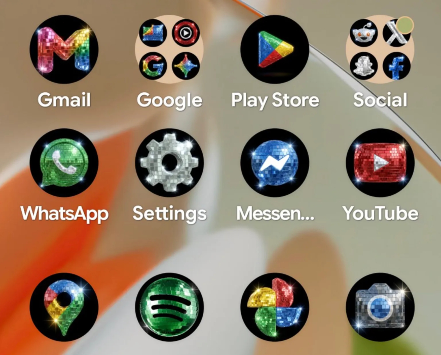
Google has joined the growing disco-ball icon trend, introducing a playful new set of Android app icons that are already generating mixed reactions across social media. The release follows the attention surrounding Spotify’s temporary disco-ball-themed app icon, which sparked both criticism and praise from users celebrating the company’s 20th anniversary.
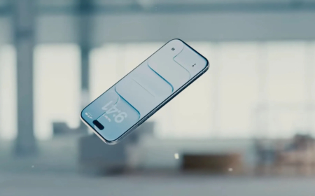
The new icon pack was revealed by Sameer Samat, who shared a screenshot on X showing a Pixel home screen covered with glittery disco-inspired app icons. Alongside the image, Samat joked, “Your wish is our command. Disco icons available on Pixel as of today … Are you all sure you still want this?”
The feature arrives via Pixel’s custom icon system, which lets users personalise app icons with various AI-generated visual styles. Previously, Pixel owners could mainly adjust icon colours to match wallpapers and system themes. The newer customisation options provide more dramatic visual transformations.
Google introduced the custom icon feature earlier this year through its March Pixel Drop update. The update added several design templates, including hand-drawn styles such as “Scribbles,” the metallic-themed “Treasure,” the colourful “Easel” design, and other artistic variations. The new disco-ball theme expands that collection with a distinctly flashy aesthetic.
The release did not come entirely out of nowhere. Earlier in the week, Samat jokingly asked users on social media whether Android should adopt a disco-themed icon pack, sharing an image of the Chrome logo redesigned as a miniature disco ball. What began as a lighthearted idea quickly became a real feature.
Reactions online have been divided. Many users previously criticised Spotify’s glittery anniversary icon, describing it as distracting or unattractive. Spotify responded by reminding users that the design was only temporary, joking that “glitter is not for everyone.”
Google, however, appears more willing to embrace the playful trend. While some users consider the sparkling icons excessive, others appreciate the whimsical design and the ability to transform their home screens completely.
The trend also reflects a broader cultural fascination with playful and nostalgic aesthetics. Recent reports have noted that younger generations are increasingly embracing colourful, unconventional designs as a form of creative expression and lighthearted escape.
Google is not the only company experimenting with the disco-ball look. Lovable recently launched a tool that applies disco-inspired effects to logos and graphics, further extending the trend beyond smartphone interfaces.
Social media reactions ranged from criticism to amusement. Former Pixly co-founder Race Johnson joked that the icons make a phone look like it received “bottle service,” while another user summed up the mixed feelings shared by many commenters with a simple reaction: “It’s awful. I’ll take it.”
Whether viewed as stylish, ridiculous, or somewhere in between, Google’s latest customisation option has certainly succeeded in getting people talking—and perhaps adding a little extra sparkle to Android home screens in the process.
What's Your Reaction?
 Like
0
Like
0
 Dislike
0
Dislike
0
 Love
0
Love
0
 Funny
0
Funny
0
 Angry
0
Angry
0
 Sad
0
Sad
0
 Wow
0
Wow
0